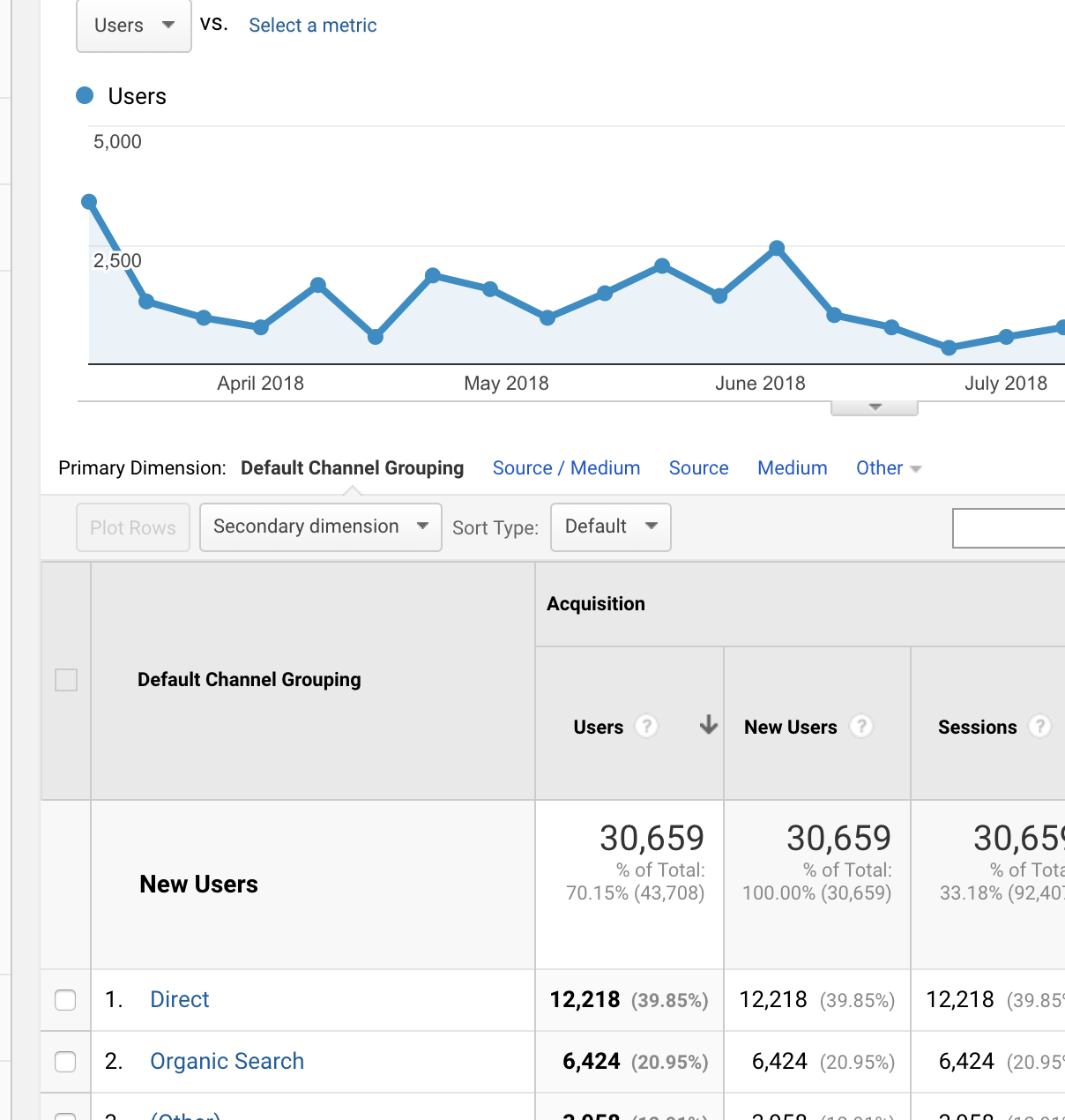
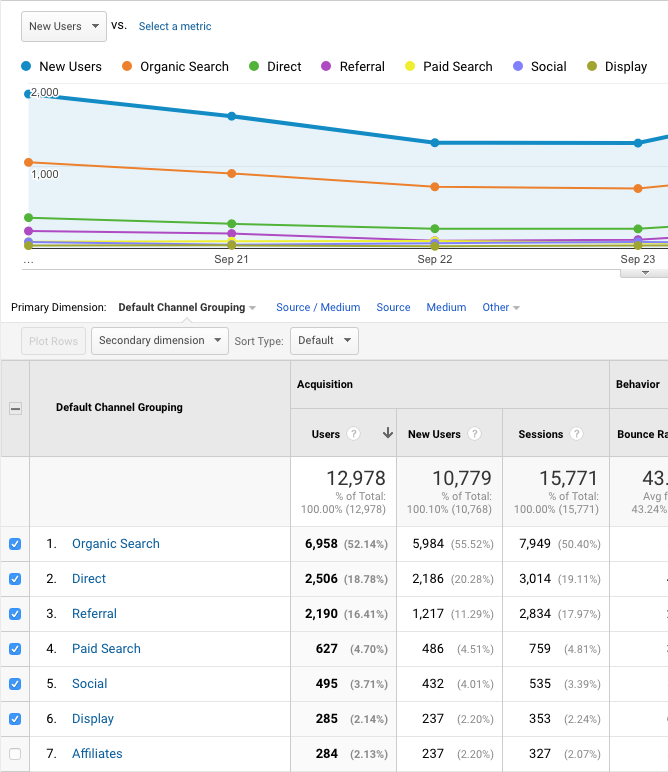
Within Google Analytics, the best you can do is the "plot rows" option along with changing the metric shown in the graph to New Users. You can select only up to 6 rows, and they are plotted independently, not in a stack. From Google's demo account:

However, you can get the kind of graph you want in Google Data Studio quite easily.
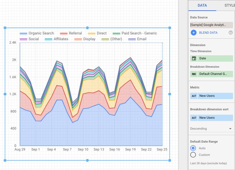
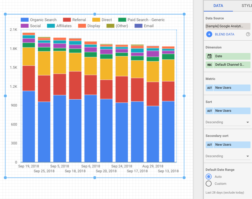
After signing in to Data Studio and connecting your GA account (here is Google's documentation for adding a data source) you'll start a new report and add an area graph or a bar chart to it. You can also get acquainted with Data Studio using the sample GA data they provide, which is what I used for the screenshots below.
[Side note: the graphs are squashed for better-fitting screenshots - they could be twice as wide and half again as tall as they are.]
For an area graph, I set the dimensions to Date and Channel, and the metric to New Users. There are longer stretches of time available as well, up to Year.

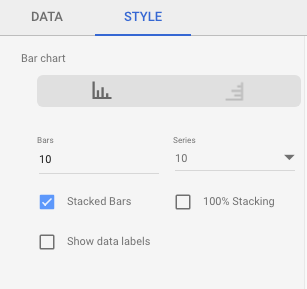
For the bar chart, there are two steps; first I set the dimensions to Date and Channel and the metric to New Users, and then second I changed from Data to Style in the sidebar and selected Stacked Bars in the Bar Chart section. By default you get a cluster of side-by-side bars.


Everything else shown in the screenshots is the default setting or happened automatically when I set the metric and dimensions.

