1

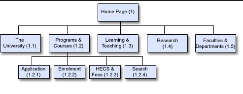
This might be a simple question BUT - I'm having a hard time understanding internal navigation, specifically navbar links which apparently should form a hierarchy, as seen by image below from MOZ

enter image description here

My site navigation looks like this:

enter image description here

  • I have 3 links at the very top as can be seen on the image
  • the website name is in the middle with a link
  • main navbar is at the bottom, no dropdowns

MY QUESTION

  1. I do not understand the hierarchy in image one, how can homepage by only one link which links down to other pages?
  2. Is having dropdown menus consider beneficial?
  3. I have about 80 pages, I am considering changing my nav structure making dropdowns from wordpress tags to relevant category in the navbar, is this a wise move or will I lose more than I will gain?

    4.Is the overall layout of my nav structure considered okay when looking at image 2?

UPDATE:

When doing a branded search for my site google displays 6 links, the 6 links displayed is wrong though, it shows 4 pages (good) and 2 (posts... which is a bit weird?) The 2 posts that is displayed with the pages has very strong backlinks pointing at them though

2
  • It looks like that diagram represents pages and which other pages they would have in their menus. So if you are on the home page you see the top level items, but if you click to "Programs & Courses", a sub-menu would expand. It could also be done with a mult-level menu that expands via user interaction, but I wouldn't expect "Home" at the top level in that case. There could be a top level "hamburger" menu for mobile. Commented Nov 8, 2016 at 14:43
  • 1
    "...how can homepage by only one link which links down to other pages?" - Not "one link". To me, that diagram suggests the homepage links directly to the 5 sub pages. Whether you display that in a dropdown or a static menu (or both) is entirely up to you. Only 5 items I would suggest having a static (always visible) menu. The "problem" with dropdowns is that the user must first open the dropdown to see the links.
    – MrWhite
    Commented Nov 8, 2016 at 19:36

1 Answer 1

1

To help with question #1 the Moz hierarchy image represents a typical web site layout with one starting home page usually called index.html. From that first page users can go to any of the sub-pages (child pages of index.html). How the navigation looks on the page is up to the site design such as left or right nav, top nav bar, drop down links, buttons, etc.

Knowing how users see the site nav (which relates to hierarchy) and how a search engines views it are important distinctions.

Your website has its own home page and five child pages (rubgy, cricket, etc.) With only that small set of pages I wouldn't change the nav to a drop down list. You're adding more clicks for the users to see the other pages. Navigating your site should be easier not hard. Dropdown lists are usually used when there is a lot of material, too much to show at once.

You mentioned the navigation is at the bottom of the page. That layout is again asking the user to do more work. They land on your site for first time and only see the top 5 pages (link in top nav). Why would they know to go to the bottom of the page to see more pages? Usually the bottom area is used as a footer and a larger site map with simple text links to major pages of the site. It generally isn't intended to substitute for well designed top navigation.

Your Answer

By clicking “Post Your Answer”, you agree to our terms of service and acknowledge you have read our privacy policy.

Not the answer you're looking for? Browse other questions tagged or ask your own question.