2

I'm looking at various grid systems to make a responsive design, but I keep coming across the same thing that puzzles me: What's a row in a design where everything can move based on the screen size?

Say I want the following design on a large screen:

enter image description here

Which turns into that on a mobile screen:

enter image description here

Columns make sense to me; I can make my blocks span as many of them as needed, but aren't rows specific to one screen size?

1
  • 1
    This is what can make using grids for responsive design difficult or confusing. Just call a horse a horse and don't worry about it.
    – Rob
    Commented Feb 21, 2013 at 15:15

4 Answers 4

1

Rows hold all data in one heap. Also, you can threat row as 100% width column if you wish to.

Also, because of row, you can do CSS magic with :first-child selector for instance. You have to use it if you have, let's say, 4 columns, every 25% wide, but you want only 3 margins (between 1st and 2nd, 2nd and 3rd, 3rd and 4th column). Notice that you DON'T want margin after 4th column (because it would be asymmetric ). Then, you target first column (first child) of the row and give him in CSS {margin-left: 0;}, the other ones have margin-left set. Columns are wide 22% and margins are 4% which equals 22*4 + 4*3 = 88 + 12 = 100%.

Another example that I can see right now is when you want to group "cells" or columns in some way. It's often case, but the most representative example is probably navigation bar: You will give some class to entire row (background of navigation, etc.) and you will give some class for every single cell (hover, color etc.) In that case, on every resolution, buttons/cells will be in bar/row and site will be displayed nicely.
1

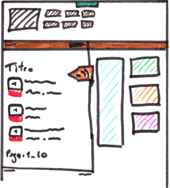
Grid (or responsive grid) is what you are referring to with your images. Where a standard web page can collapse down into a format usable for mobile screen viewing.

Take a scratch sheet of paper and draw a tic-tac-toe board. If you drew a border (or square) to surround your tic-tac-toe board, you would see a website layout with 3 columns (up and down) and 3 rows (side to side).

It is true that you can write your CSS Grid code so that any particular item is assigned "that spot"... but you don't have to. If you use a container (could be your <header>, or <main>, or just a <div>) and assign the class="item" to the parts inside that (whether they are images, or paragraphs, etc). When the viewpoint is a mobile phone, those items will stack differently than when the same page is displayed on a desktop monitor.

@charset="UTF-8"
/* no media query necessary */
.container {
    display: grid;
    grid-template-columns: repeat(auto-fit, minmax(100px, 1fr));
    // nothing about rows
}

.item { 
    // nothing about item placement
}

Note: the above code came from Jen Simmons' Layout Lab on YouTube

0

Line height, so there's a consistent vertical rhythm. You can scale that proportionally, as with other dimensions.

3
  • Why the down votes? Please add comments if my answer is wrong.
    – GDVS
    Commented Jan 24, 2013 at 8:40
  • I don't know who downvoted. So you're saying that blocs don't need to reside in a specific "row" ?
    – Manu
    Commented Jan 27, 2013 at 16:16
  • @Manu No, the opposite really. If you drew a layout on ruled notepaper, using the lines to impart a regular vertical spacing, you could maintain the regularity of the spacing even if you re-arranged the elements of the design. You could even alter that spacing in proportion to the width of the overall design, if you wanted to.
    – GDVS
    Commented Jan 29, 2013 at 8:33
0

You can use flex, doesn't require any extensions such as bootstrap.

here is a working example:

<style>
.four-stacking-boxes,
.four-stacking-boxes * {
    box-sizing: border-box;
}

    .four-stacking-boxes {
        width: 100%;
        height: auto;
        overflow: auto;

        margin-top: 165px;
    }
        @media screen and (min-width: 768px) {
            .four-stacking-boxes {
                margin-top: 15vh!important;
            }
        }

        .four-stacking-boxes .fsb-inner {
            width: 100%;
            max-width: 1248px;
            height: auto;

            margin: 0 auto;

            position: relative;

            display: -webkit-box; 
            display: -moz-box;
            display: -ms-flexbox;
            display: -webkit-flex; 
            display: flex;
            -webkit-flex-wrap: wrap;
            flex-wrap: wrap;

            overflow: auto;
        }

            .four-stacking-boxes .fsbox:first-of-type {
                background-color: green;
            }
            .four-stacking-boxes .fsbox:nth-of-type(2) {
                background-color: blue;
            }
            .four-stacking-boxes .fsbox:nth-of-type(3) {
                background-color: red;
            }
            .four-stacking-boxes .fsbox:last-of-type {
                background-color: purple;
            }

            .four-stacking-boxes .fsbox {
                width: calc(50% - 10px);
                height: 200px;

                margin-right: 20px;
                margin-bottom: 20px;

                display: -webkit-box; 
                display: -moz-box;
                display: -ms-flexbox;
                display: -webkit-flex; 
                display: flex;
                -webkit-flex-wrap: wrap;
                flex-wrap: wrap;

                justify-content: space-between;

                background-color: red;
            }
                .four-stacking-boxes .fsbox:nth-of-type(2n) {
                    margin-right: 0;
                }
                    @media screen and (max-width: 1023px) {
                        .four-stacking-boxes .fsbox {
                            width: 100%;
                            margin-right: 0;
                        }
                    }

                    .fsbox .fsb-left {
                        width: 43%;
                        padding: 40px 20px;
                    }
                        .fsbox .fsb-left h1 {
                            margin: 0 0 20px 0;

                            font-size: 1.875rem;
                            color: white;
                        }
                        .fsbox .fsb-left a {
                            color: white;
                        }

                    .fsbox .fsb-right {
                        width: 57%;

                        background-size: cover;
                        background-repeat: no-repeat;
                        background-position: center;
                    }

                    .fsbox .fsb-right.ps-img {
                        background-image: url('https://i2.wp.com/www.wehuntedthemammoth.com/wp-content/uploads/2017/04/kitten.png?resize=600%2C433');
                    }
                    .fsbox .fsb-right.f-img {
                        background-image: url('https://i2.wp.com/www.wehuntedthemammoth.com/wp-content/uploads/2017/04/kitten.png?resize=600%2C433');
                    }
                    .fsbox .fsb-right.t-img {
                        background-image: url('https://i2.wp.com/www.wehuntedthemammoth.com/wp-content/uploads/2017/04/kitten.png?resize=600%2C433');
                    }
                    .fsbox .fsb-right.pc-img {
                        background-image: url('https://i2.wp.com/www.wehuntedthemammoth.com/wp-content/uploads/2017/04/kitten.png?resize=600%2C433');
                    }

                    @media screen and (max-width: 1023px) {
                        .four-stacking-boxes .fsbox:nth-of-type(1) {
                            order: 4;
                        }
                        .four-stacking-boxes .fsbox:nth-of-type(2) {
                            order: 3;
                        }
                        .four-stacking-boxes .fsbox:nth-of-type(3) {
                            order: 2;
                        }
                        .four-stacking-boxes .fsbox:nth-of-type(4) {
                            order: 1;
                        }
                    }
</style>

<div class="four-stacking-boxes">
    <div class="fsb-inner">

        <div class="fsbox">
            <div class="fsb-left">  
                <h1 class="fsb-title">Lorem</h1>
                <a href="/a">Click here »</a>
            </div>
            <div class="fsb-right ps-img">

            </div>
        </div>

        <div class="fsbox">
            <div class="fsb-left">  
                <h1 class="fsb-title">Ipsum</h1>
                <a href="/b">Click here »</a>
            </div>
            <div class="fsb-right f-img">

            </div>
        </div>

        <div class="fsbox">
            <div class="fsb-left">  
                <h1 class="fsb-title">Is</h1>
                <a href="/c">Click here »</a>
            </div>
            <div class="fsb-right t-img">

            </div>
        </div>

        <div class="fsbox">
            <div class="fsb-left">  
                <h1 class="fsb-title">Jibberish</h1>
                <a href="/d">Click here »</a>
            </div>
            <div class="fsb-right pc-img">

            </div>
        </div>

    </div>
</div>

In this example I have used the 'order' attribute to swap the order, just write a media query to decide when to allocate each 'order'.

There are a lot of ways you can manage height across a row. This is one I tend to prefer.

If you Google 'display flex css', you will have plenty of resources to read. Once you understand it, if you tail that search with 'webkits' you will get the usage with the webkits added (making it work cross browser).

Thanks, Jason.

1
  • To actually answer your question - a row is exactly what you think it is. You have a row with columns. This becomes a column with rows (where the rows are your original columns). But, for sanities sake - the row is still the row, it just pushes the content underneath giving the perception that there are multiple rows. Commented Feb 12, 2019 at 10:02

Your Answer

By clicking “Post Your Answer”, you agree to our terms of service and acknowledge you have read our privacy policy.

Not the answer you're looking for? Browse other questions tagged or ask your own question.