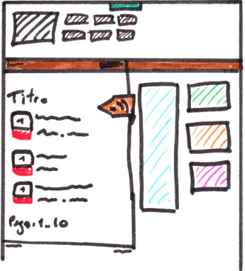
I'm looking at various grid systems to make a responsive design, but I keep coming across the same thing that puzzles me : What's a row in a design where everything can move based on the screen size ?
Say I want the following design on a large screen :

Which turns into that on a mobile screen :

Columns make sense to me ;me; I can make my blocks span as many of them as needed, but aren't rows specific to one screen size ?
