5

Where I can find statistics on what % of mobile devices browsing the web support media queries for screen widths?

I want to know whether for mobile optimization I can assume the majority of users' devices will support these, and so if I can base my optimization on using them. Thanks

3
  • What do you mean by Conditional Stylesheets? To me it means lines like this in HTML for Internet Explorer: <!--[if IE 7]><link rel="stylesheet" type="text/css" media="screen" href="css/ie7.css" />< ![endif]--> Is that what you mean? Commented Sep 12, 2011 at 11:28
  • No, I meant media queries for screen widths. Ill update my question. Thanks
    – Evanss
    Commented Sep 12, 2011 at 11:30
  • Good article here: bushidodesigns.net/blog/…
    – Evanss
    Commented Sep 12, 2011 at 14:07

1 Answer 1

3

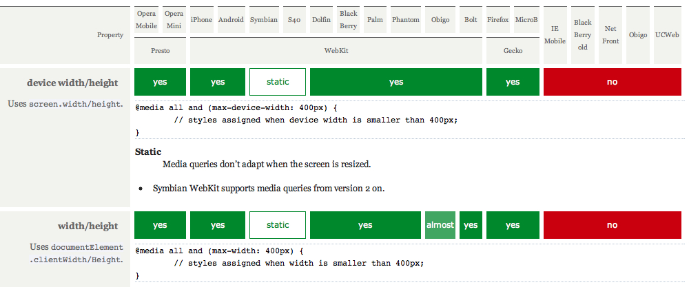
Quirksmode offers a feature support table for mobile browsers.

This page shows that almost all modern smartphone browsers support max-width style media queries. (Click image below for large size.)

enter image description here

7
  • Thanks for the link but what im really looking for is a % of users. So rather than which individual browsers or devices support media queries, if i use them how many of my mobile visitors will see the optomised site? Thanks
    – Evanss
    Commented Sep 12, 2011 at 11:54
  • @user793011 To get a percentage, you'd need to look at your visitor data (via Google Analytics or similar) and determine how many of your mobile visitors are using supported browsers. Or, better still, create a design that's 320px wide by default (e.g. using 320 and Up) and use media queries for bigger screens only. That way, all mobile browsers will get the mobile-optimised view, even if they don't support media queries.
    – Nick
    Commented Sep 12, 2011 at 12:03
  • I know that users are different for different sites so using your own analytics is best, but are their any rough stats out there already just to give me some idea? For instance is support more likely to be 0-30%, 30-60% or 60-100%?
    – Evanss
    Commented Sep 12, 2011 at 13:01
  • @user793011 About 60% seems to be a fair guess, based solely on this StatCounter breakdown of mobile browser stats from February 2011. But, as I say, designing your site for mobile first (and using CSS media queries for larger screens) means that you can serve 100% of mobile users a mobile-optimised version of the site, regardless of what browser they use.
    – Nick
    Commented Sep 13, 2011 at 7:54
  • As IE8 and before dont support media queries I dont think your solution is a good choice for mainstream sites where IE has a decent market share. Thanks
    – Evanss
    Commented Sep 19, 2011 at 14:24

Your Answer

By clicking “Post Your Answer”, you agree to our terms of service and acknowledge you have read our privacy policy.

Not the answer you're looking for? Browse other questions tagged or ask your own question.